


Multiple timeframe analysis
It is often said that being well prepared for the trading day is a battle half won. This cannot be far from the truth. We cannot jump to an empty chart, start trading right away and think we can profit. We need to have a plan. A trading plan. In this lesson, we’ll look at how to draw a simple trading plan directly on the chart and how we can implement it right away to start trading.
Multiple timeframe analysis
All traders are different, we will hardly find two traders with the same strategy and view on the markets. Knowing that, we know we cannot satisfy everyone’s opinion but it’s ok. In this article, we are going to break down the chart of GBPUSD which is a heavily traded pair and we’ll use a simple price action with horizontal and diagonal support and resistance and also a volume profile to easily spot areas of heavy distribution and path of least resistance. All of our steps are going to be explained in depth so no worries, we are sure they are really easy to follow. Because the preparation is best done when markets are calm, weekends are best suited for the job.
Weekly chart
Since the majority of traders specialize in intra-day and intra-week trading, we are not going to a higher timeframe than weekly. Of course, monthly, quarterly or yearly charts can uncover some macro directional details but for intraweek and intraday trading you do not need to pay too much attention to them.
When looking at the weekly chart, we should always ask ourselves questions such as:
- Where is the market going?
- What has been the general direction of the last few weeks?
- What happened last week? Was the market trending or ranging?
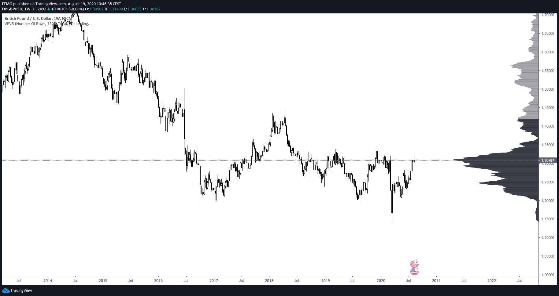
As we can see in the above chart, the weekly timeframe functions as our broad navigation. Before drawing any lines to the chart, we should take a look at the price movement alone. After this observation, we can notice GBPUSD broke out from a 2-month long trading range at the end of July. The price was ranging during the past two weeks, which signals that some bigger move might be coming soon. After this, we can draw support and resistance lines using price action. When marking out our weekly chart, there is no reason to go thousands of pips above and below the market price, as there is a very little chance the price is going to reach there during the following week.
We used purple colour to mark out our weekly levels. We simply marked out support and resistance levels using price action. Because we are looking at Forex, where the volume is calculated by the executed bid/ask movement, we put more emphasis on the price action rather than volume. Trading indices or commodities, doing things another way around, might be better for those assets.
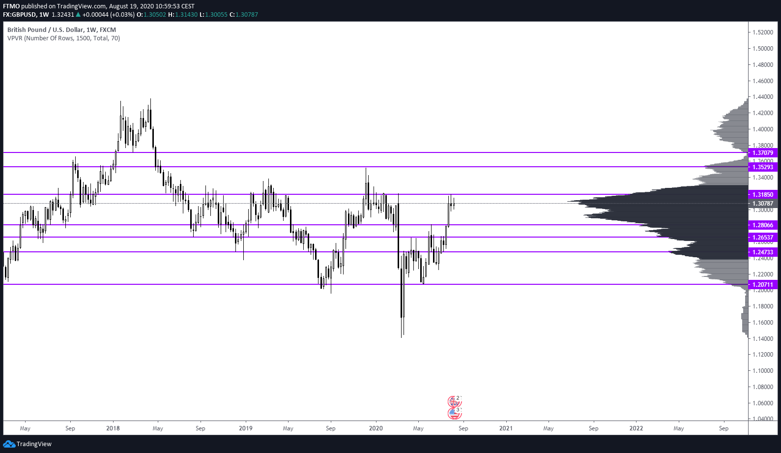
Daily chart
Looking at a daily chart gives us a more detailed look at the actions of previous days.
We are going to examine the past trading week and ask questions such as:
- What was the direction last week?
- Was the market in range or trending? Should we look for a trend continuation or a mean reversion?
- Is the market over-extended?
- If we could only use a daily chart for trading, which direction would we say the market will go?
- What are the macroeconomic events planned for next week and at what time and day they are?
In responding to these questions, we can mark out our chart with lines.
We marked out daily levels with the blue line, and once again we marked out the most recent levels where the price bounced from. We also boxed out the recent trading range with shaded grey colour, for reference, we also shaded the areas from the past with a similar price behaviour, as we can notice from the past examples. Every time GBPUSD was in a very tight range like this one, we had a big expansion shortly after. This gives us a clue that we can expect more of a trending movement next week.
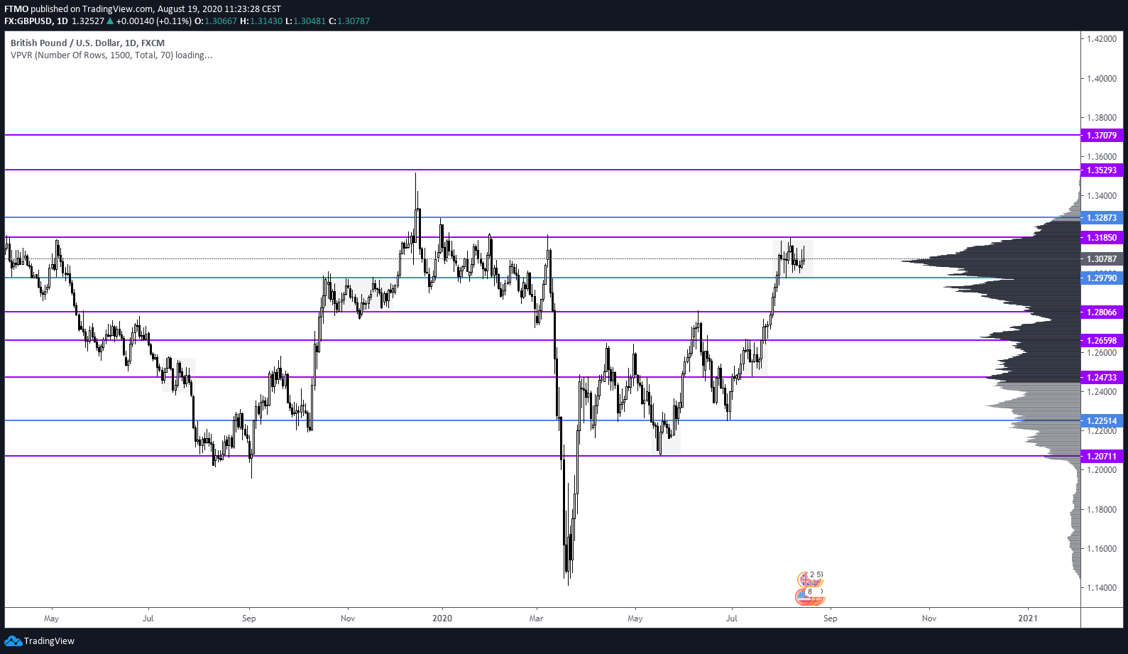
Execution chart
This is completely up to us. Some traders like to enter their trades on H4, H2, H1 or whatever time frame is suitable. For this example, we use H1 timeframe for marking out levels and also entering and exiting potential trades. Our intraday/execution chart should be revisited not only during the weekend but also in the morning before we start trading, these levels change pretty often so there might be a need to adjust them accordingly.

We marked out our hourly levels in orange, and we also added arrows for better visualisation of possible movements, this is not necessary, but it can help, especially in the learning stage. We also added two possible scenarios for trades to unfold. One for a short trade and one for a long. We are ready to tackle the market next week with this being marked out. We must be mindful of our levels and macroeconomic releases coming into the new trading day. Of course, we can use indicators or anything else to mark out our levels, it’s completely up to us. The main takeaway from this article is to understand the bigger picture of the market, what it’s trying to do and where it’s trying to go, and more importantly, being prepared for every piece of movement. And as we can see, the market did this right after the opening. Take a look at how it bounced and stopped in front of our levels and how it followed our plan.

