Technical Indicators
Using technical indicators in trading is a never-ending discussion among traders. Some would say they are useless, some can’t imagine trading without them. Understanding the technical indicators is something every trader should master, regardless if he or she decides to use them or not. We picked the top 11 technical indicators, which in our opinion are the best and they can improve your trading significantly.
Technical Indicators
Technical indicators are mathematical calculations based on price or volume. They are used mostly by technical traders, in other words, those who trade by using technical analysis. Technical indicators provide traders with additional information on what market conditions are right now and the potential direction of the next move. If you are an experienced trader, you most likely know that hundreds of indicators are available on trading platforms. You certainly don’t need to use all of them, rather, you should be able only to add those which are working for you or fitting your trading plan to maximize profit potential in your strategy or trading system.
MACD Indicator
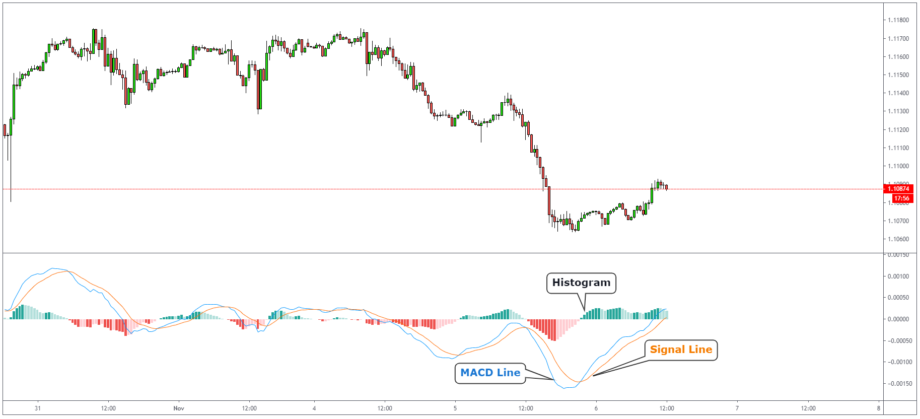
MACD is the acronym for Moving Average Convergence Divergence, it’s a trend following technical indicator that shows a difference between two lines, the MACD line and the Signal line. The MACD line is calculated by subtracting a 26-day exponential moving average from a 12-day exponential moving average. The signal line is a 9-day exponential moving average of MACD itself. The histogram gets bigger as 2 lines diverge and disappear when they cross each other.
How to trade with MACD Indicator?
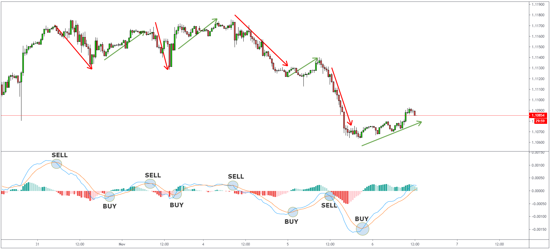
When MACD crosses the Signal line, it is perceived as the start of a new trend. Falling below the Signal line indicates the signal to sell and rising above it suggests that it is time to buy.
MACD Divergence
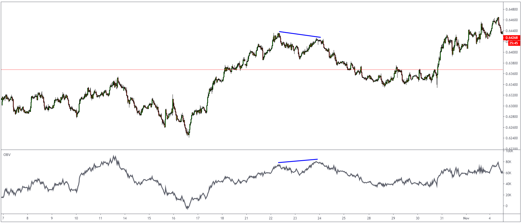
MACD is also one of the preferred indicators to use in spotting a divergence in the market.
What is divergence?
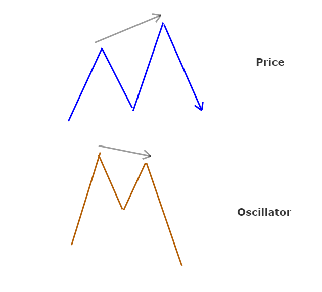
We talk about MACD Divergence when the price of the traded instrument starts moving in a direction that is different from MACD, a reversal of the current trend is likely to occur. We can see divergence both on MACD Histogram and also the MACD line.
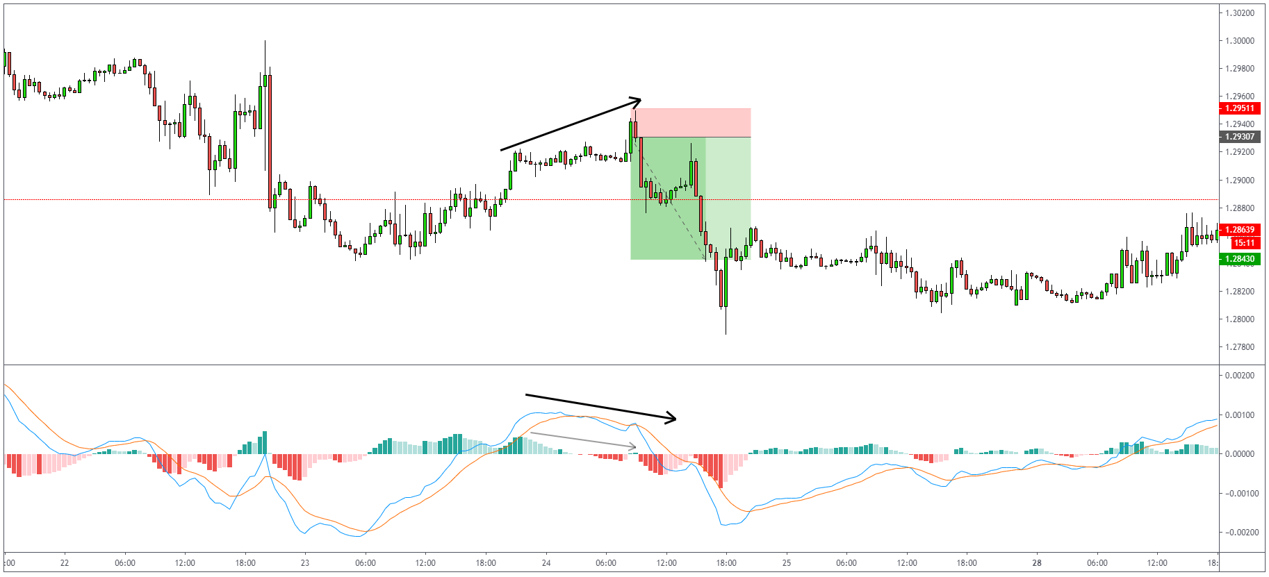
As you can notice on the chart below, the price of GBPUSD is going higher, but at the same time, MACD is showing us lower. This is what we call MACD Divergence. Let’s have a look at a few more trading examples.
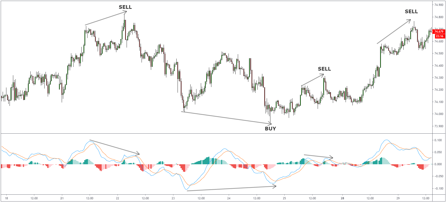
Divergence can be spotted on any instrument and any timeframe. You can see how many nice and working examples we have on the above AUDJPY 30-minute timeframe.
RSI Indicator (Relative Strenght Index)
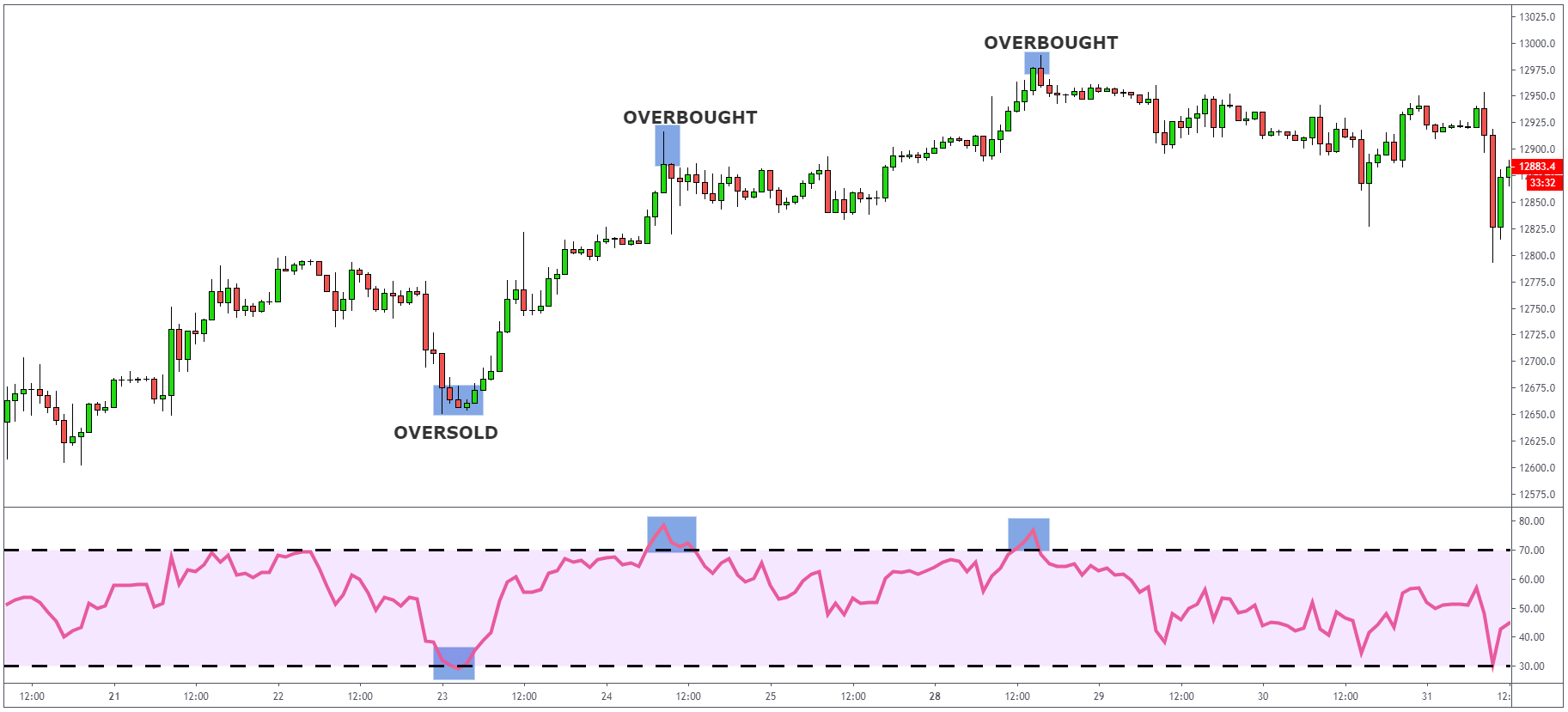
RSI stands for Relative Strength Index, it is a momentum oscillator, but it measures the velocity and magnitude of price movements on a scale from 0 to 100. Generally, when the RSI shows a reading at 70 and above, we can assume that the instrument is being overbought, and the price should go to the downside. Readings at 30 and below suggest that the instrument is oversold, and we should see the price going higher.
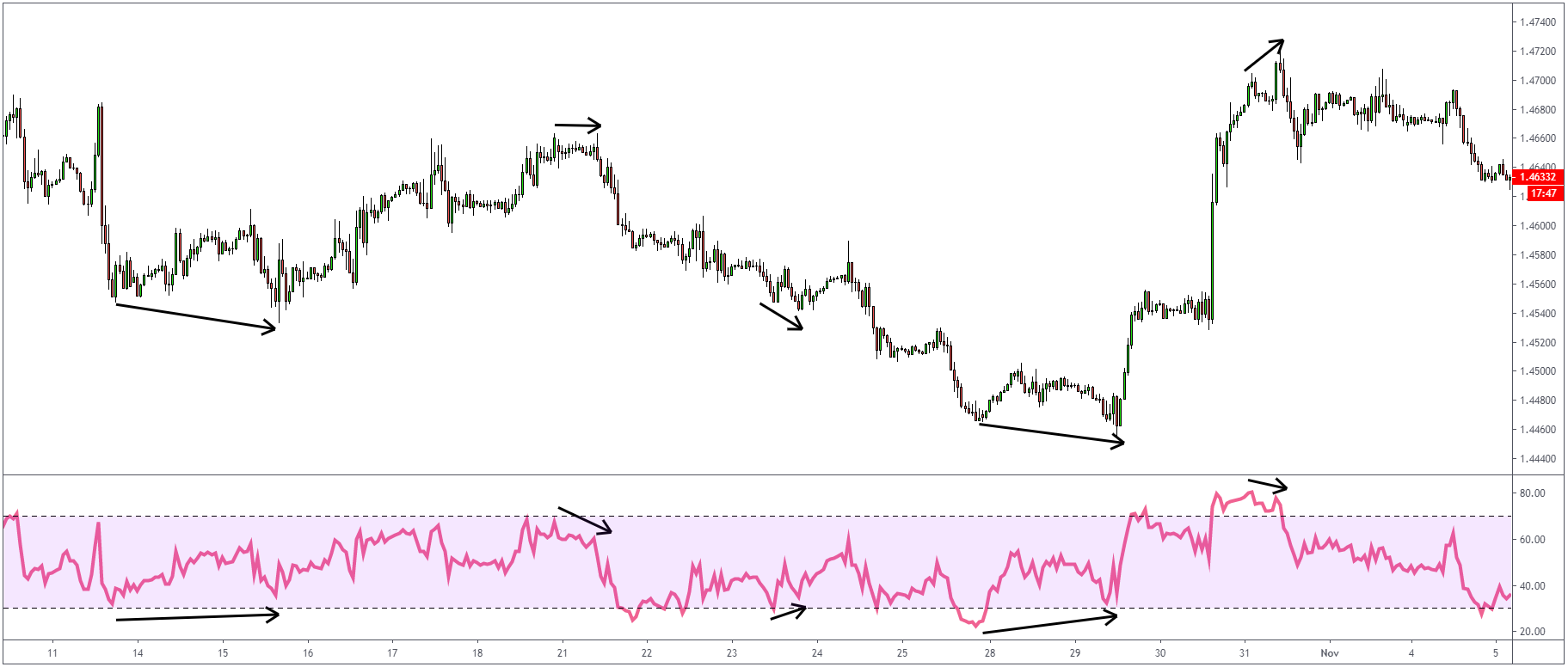
RSI can be used to confirm trends. If a downward trend is occurring, the instrument should be found fluctuating between 10 and 50, if RSI breaks out of that level, it often corresponds with the break of a price as well. The same goes for an uptrend, except the instrument moves between 50 and 90.
RSI Divergence
If both RSI and price experience trends but in opposite directions, divergence can signal a price reversal same as with divergence on MACD. One thing worth mentioning is that during strong trends, divergence is likely to appear without breaking the trend.
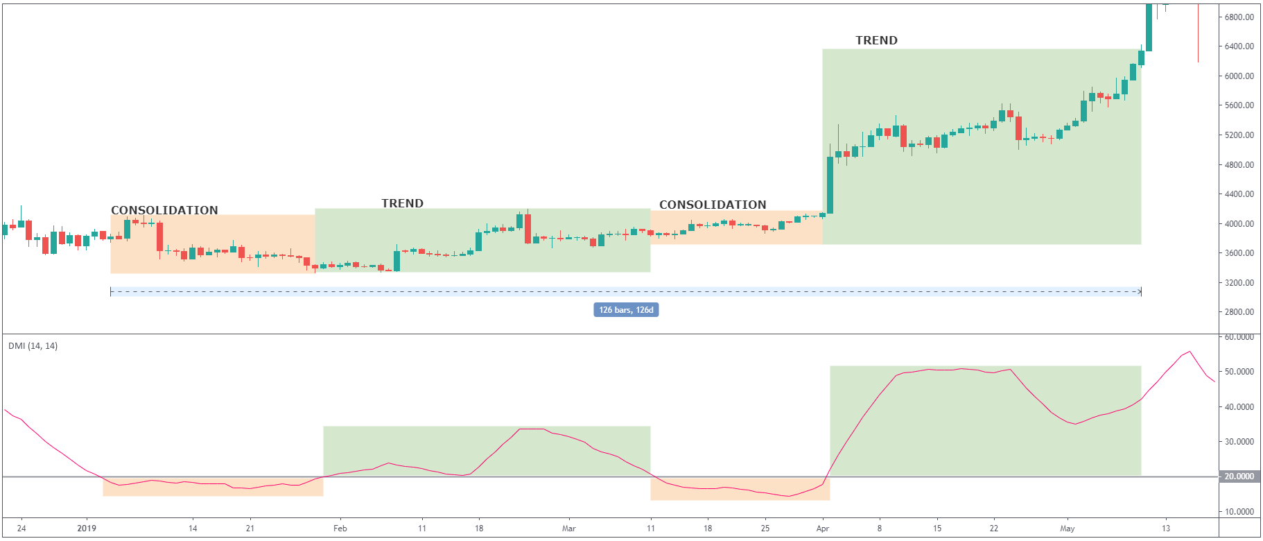
ADX Indicator
Staying with the oscillators, we will talk a bit about the Average Directional Index also known as ADX. Unlike to RSI and MACD, ADX doesn’t determine if the trend is bullish or bearish, but it shows the strength of a current trend. Once you add the ADX indicator to your chart, you will see it fluctuating between 0 and 100, whereas readings below 20 generally mean a weak trend, and if ADX is above 50, it means the trend is strong.
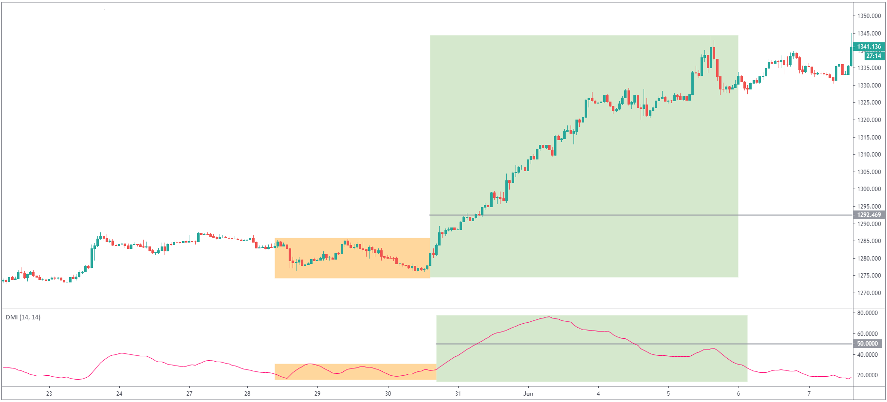
On the chart above, you can notice how the price was in consolidation at the same time as ADX indicator was fluctuating around level 20; once the price started trending higher, ADX broke 50 levels and gave the signal of a strong trend which indeed followed. From this example, you can see that ADX is a useful indicator for determining if the market is ranging or starting a new trend.
The stronger the trend, the higher the ADX indicator value, regardless of the direction of the trend.
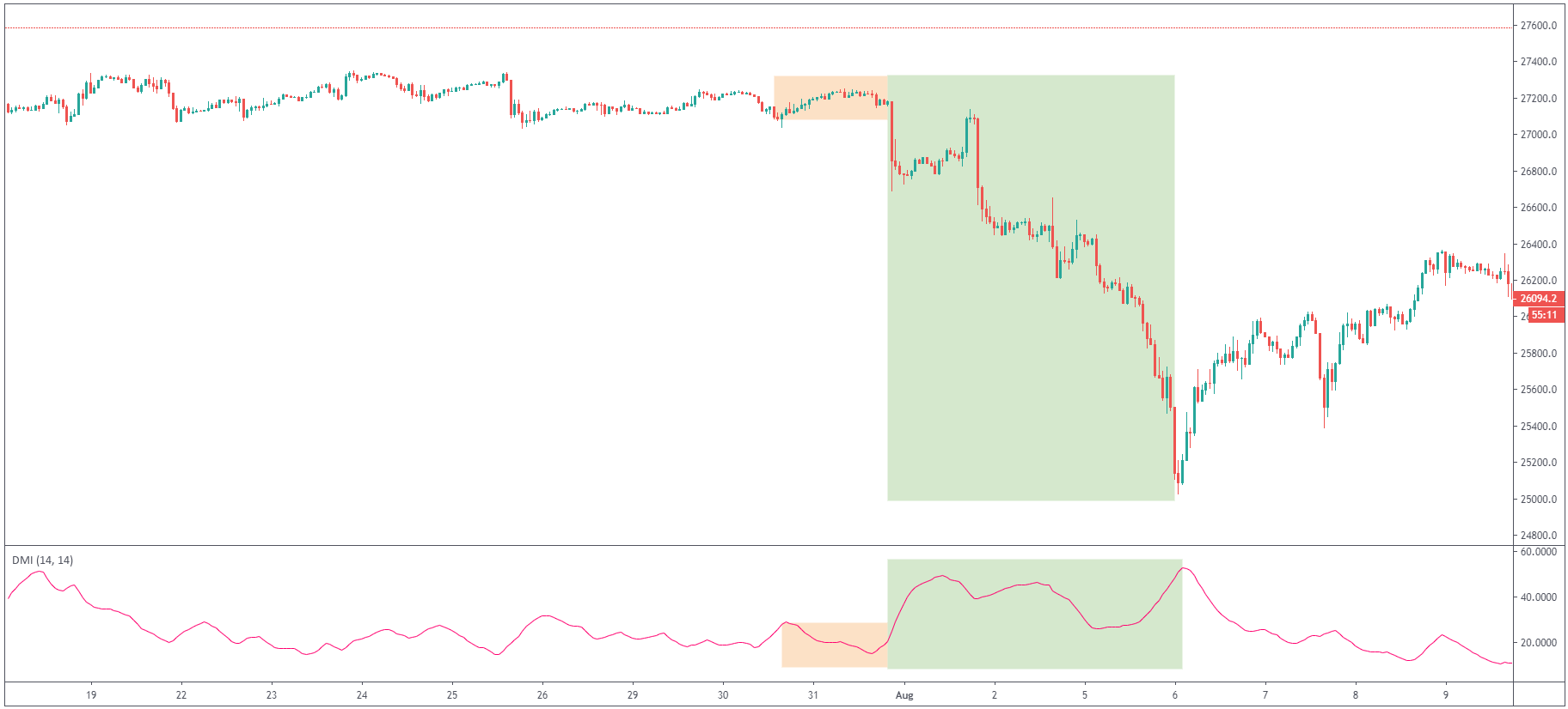
You can notice here on Dow Jones how ADX indicator started rising rapidly, confirming the new downtrend’s strength. Before we look at another indicator, here is a 4-month trading range in Bitcoin and a great example of how ADX would help you identify the current trading environment.
Ichimoku Cloud
This is one of the more complex indicators, with a strong fanbase of traders who would swear on this indicator. Frankly, many of them don’t need anything else besides the Ichimoku Cloud for their trading. Ichimoku Cloud is a momentum indicator that determines the direction of the trend but also calculates future levels of support and resistance. This makes it unique because it is one of the few indicators which is not lagging behind the price.
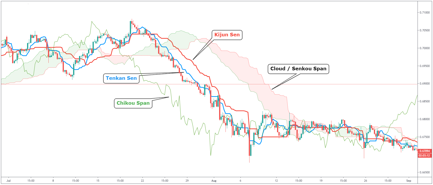
Does this seem like one big mess? No need to worry. Let us explain everything you see in the chart above.
Kijun Sen (red line)
Also known as the baseline, which is calculated by averaging the lowest low and the highest high for the last 26 periods.
Tenkan Sen (blue line)
Also known as the conversion line which is calculated by averaging the lowest low and the highest high for the past 9 periods.
Chikou Span (green line)
Also known as the lagging line. This shows the closing price plotted 26 periods behind.
Ichimoku Cloud / Senkou Span
Every cloud is made of two lines which are used as borders for the cloud. The first line is calculated as the average of Tenkan Sen and Kijun Sen and plotted 26 periods ahead. The second line is calculated by averaging the lowest low and the highest high for the last 52 periods and plotted 26 periods ahead.
Ichimoku Cloud Trading Strategy
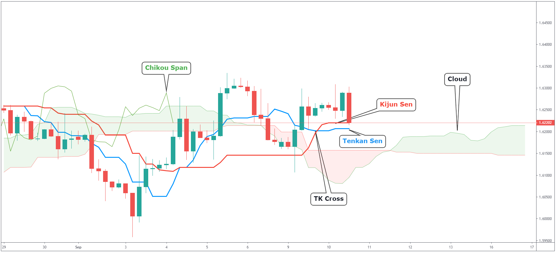
Let’s have a look at the above GBPCAD 4-hour chart and break down separate parts of the Ichimoku Cloud.
Kijun Sen
We watch Kijun Sen as our indicator of the general direction of the price. You can think about it similar to the moving average – if the price is above Kijun Sen it means bullish. If the price is below, it means bearish.
Tenkan Sen
Similar to Kijun Sen, but Tenkan Sen is also indicating market conditions. If Tenkan Sen is moving up or down, the market is trending. If Tenkan Sen is moving horizontally, it signals that the market is ranging.
TK Cross
Crossover of Kijun and Tenkan Sen. This generally means there is a change of direction in the market and when Tenkan is above Kijun Sen, we are in a bullish market. If the opposite happens, we are in a bearish market.
Chikou Span
This one is simple. If Chikou Span is above the price – this is a bullish signal. If it is below, that’s bearish.
Cloud
The cloud acts as support and resistance. If you take a look at the chart above, you can see that the price is currently trading above the cloud. This means that if we are going lower, we can use both cloud levels as support areas. From looking at the GBPCAD chart above, you can see that we recently had a bullish TK Cross, Chikou Span is trading above the price and we are above the cloud. This seems like a decent buying opportunity, right?
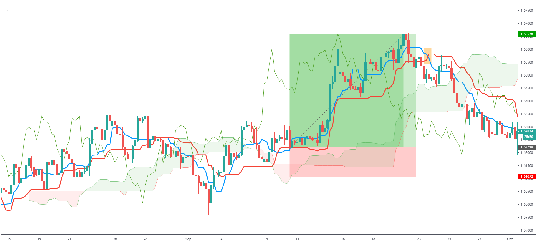
As you can see, the price indeed went up and we were able to catch this great long trade. Also, pay attention to the bearish TK cross (orange) and the change of direction of the trend.
On Balance Volume (OBV)
Made by Joe Granville in the 1960s, On Balance Volume (OBV) is a technical indicator which helps traders make decisions about future price movement based on the previous trading volume of the asset. OBV indicator is watching the volume of trades and also if the push of the price is higher or lower. On Balance Volume is used in technical analysis to determine buying or selling pressure in the market.
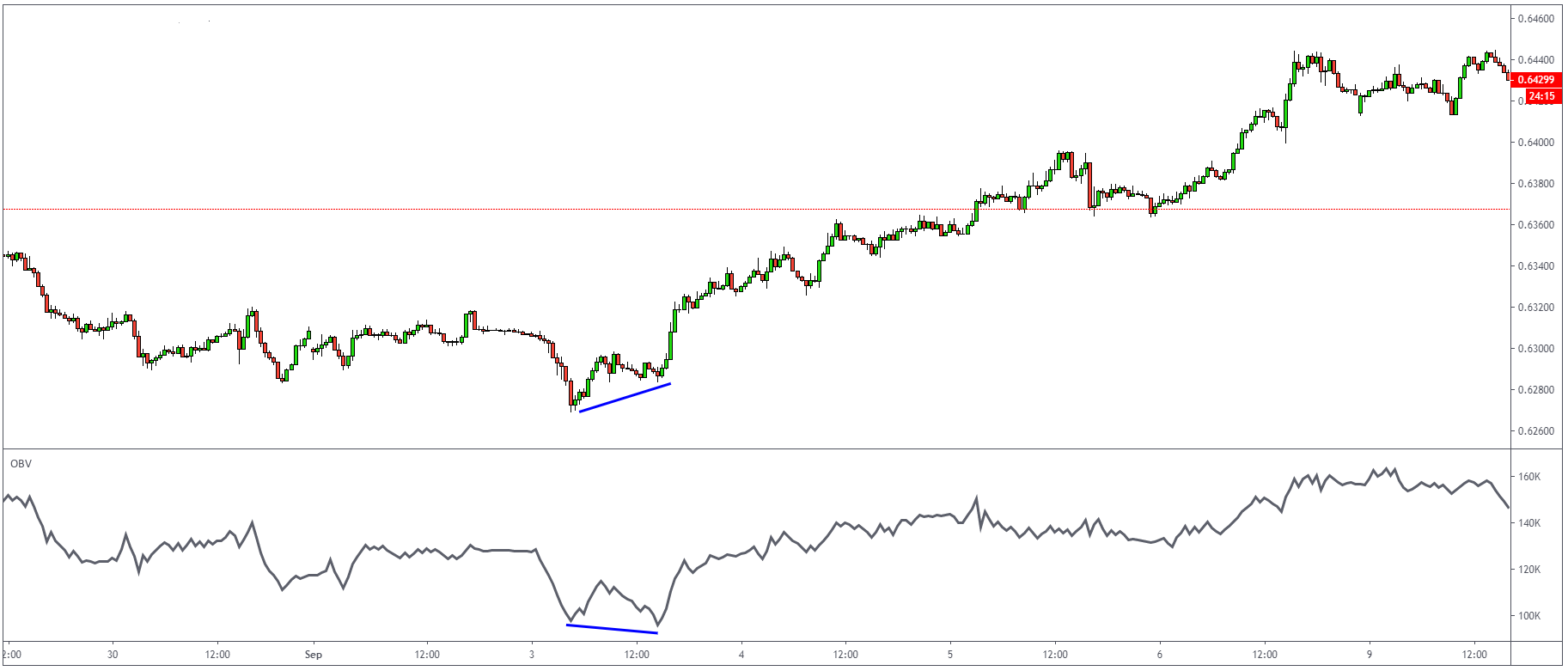
OBV Trading Strategy
On Balance Volume Trendline strategy is a simple way to use a trendline on OBV and monitor the current price action. As you can see from the example below, the price of EURUSD was in consolidation, which is something that can confuse a lot of traders. But if you would add the OBV indicator to your chart, you can notice that OBV broke above the down steep trendline, which signalled the end of consolidation and higher prices.
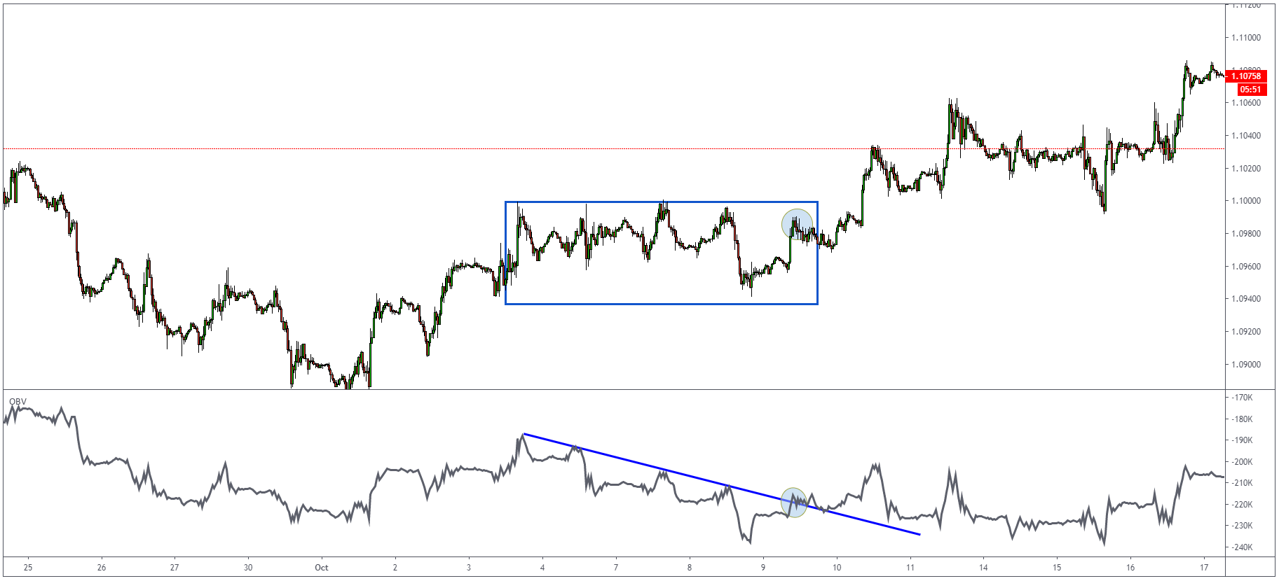
In another example, you can see how using the OBV indicator would help us prevent getting into the bad trade on a trendline fakeout.
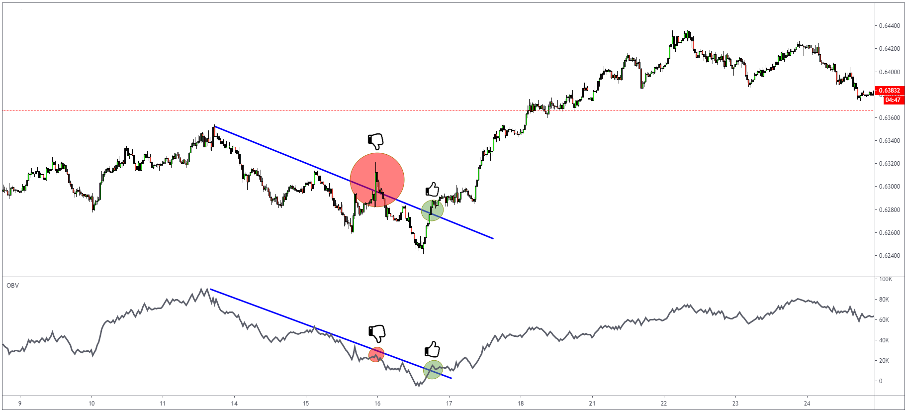
OBV Divergence
Another way how to use OBV is watching for divergence – same as with other oscillators we described above.
Stochastic Oscillator
Another oscillator is called Stochastic. It comes from the Greek word stochastics, meaning able to guess. The Stochastic oscillator can be used for any type of trading such as scalping, day trading but also long-term swing trading. Same as RSI, Stochastic shows overbought and oversold conditions, but it will also give you buy/sell signals for crosses which are made from %K and %D lines.
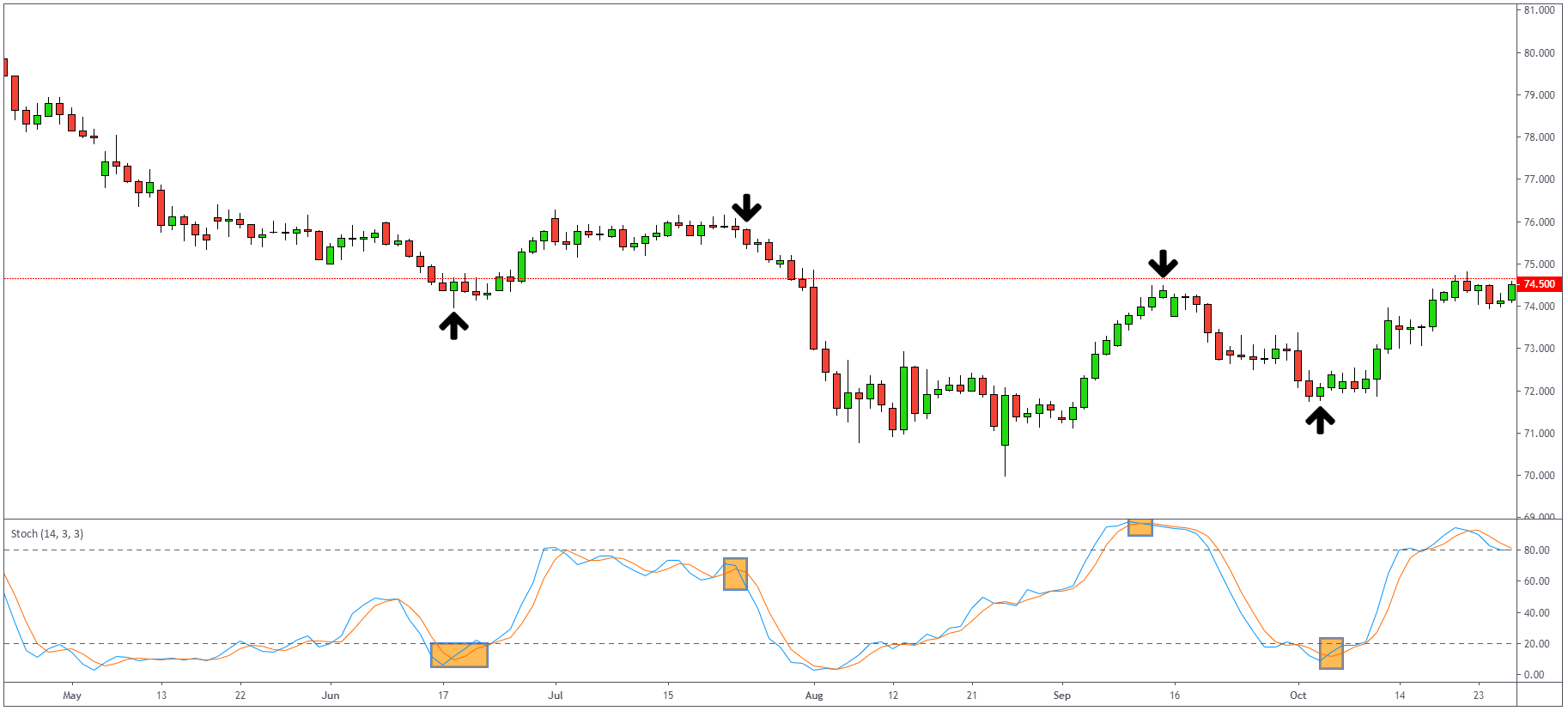
You can see the pretty decent signals on a Daily AUDJPY but also on a 5-minute chart of Gold.
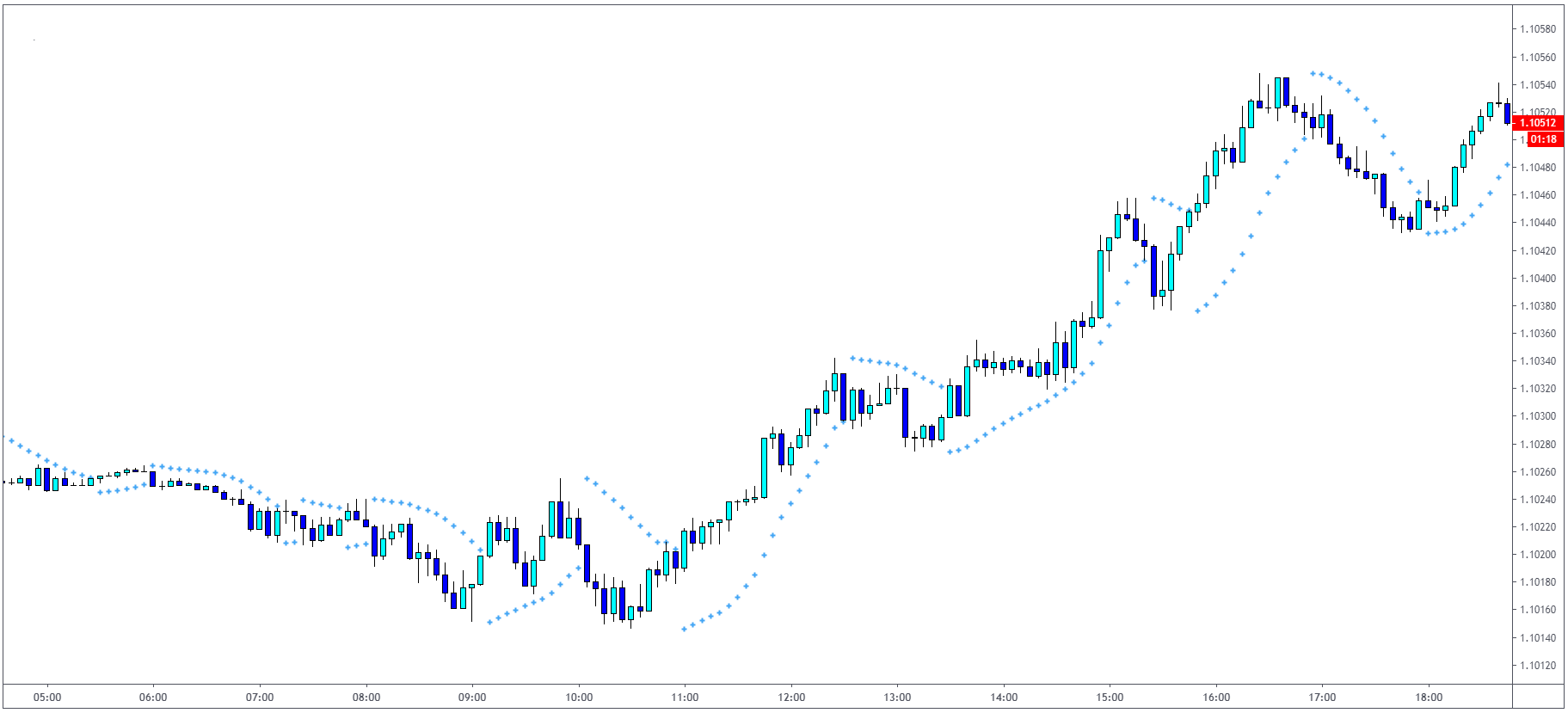
Parabolic SAR
Trend following is definitely one of the most popular trading strategies traders all over the world use. To be able to define trends in the financial markets, it is definitely a useful skill to have. That’s why we have a variety of technical indicators to help us and Parabolic SAR is one of them. Parabolic SAR (SAR means “stop and reverse”) is the indicator which is not only showing a trend direction but also signals when it ends and reverses. You can see how Parabolic SAR is displayed on the chart. Dots above the candles mean that we are in the bearish trend and vice versa.
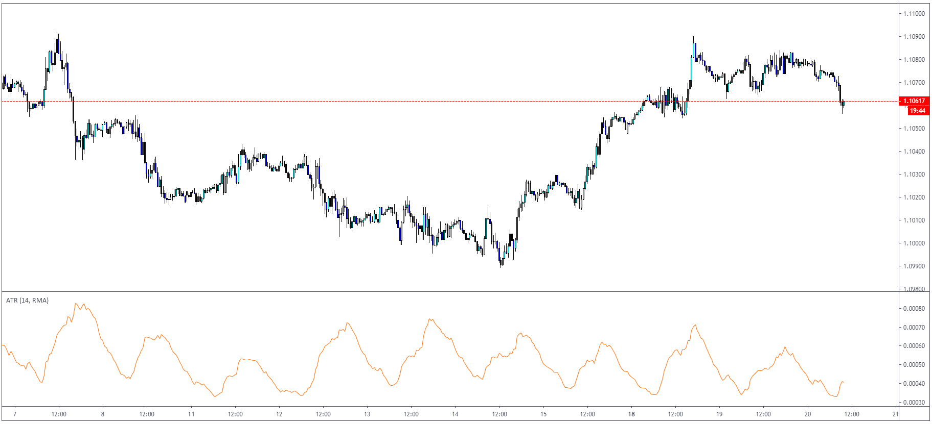
Average True Range (ATR)
Average True Range is probably one of the most popular indicators among retail traders. ATR measures market volatility, which is a very important factor in trading. Every trader should be aware of current market conditions and volatility. We don’t want the market to be too volatile because in that case, it is hard to predict the next move. But on the other hand, when the market stalls, we cannot benefit from that as well.
To represent real volatility in the market, we have to look at the previous data we have. ATR indicator is measuring:
- Distance between current high and current low.
- Distance between previous close and current high.
- Distance between previous close and current low.
After that, it takes an average price of past trading days which represents the volatility in the market.
How to trade using the ATR indicator?
ATR can be used in several ways. One of the most popular is to use the ATR with stop-loss placement. For example, if the ATR indicates 4.7 pips in EURUSD / H1 timeframe, you can assume that the market should not exceed this value once you are entering a long trade – example marked on the chart below.
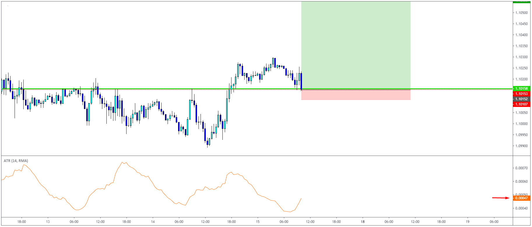
As you can see, the market did not exceed hourly ATR and continued higher.
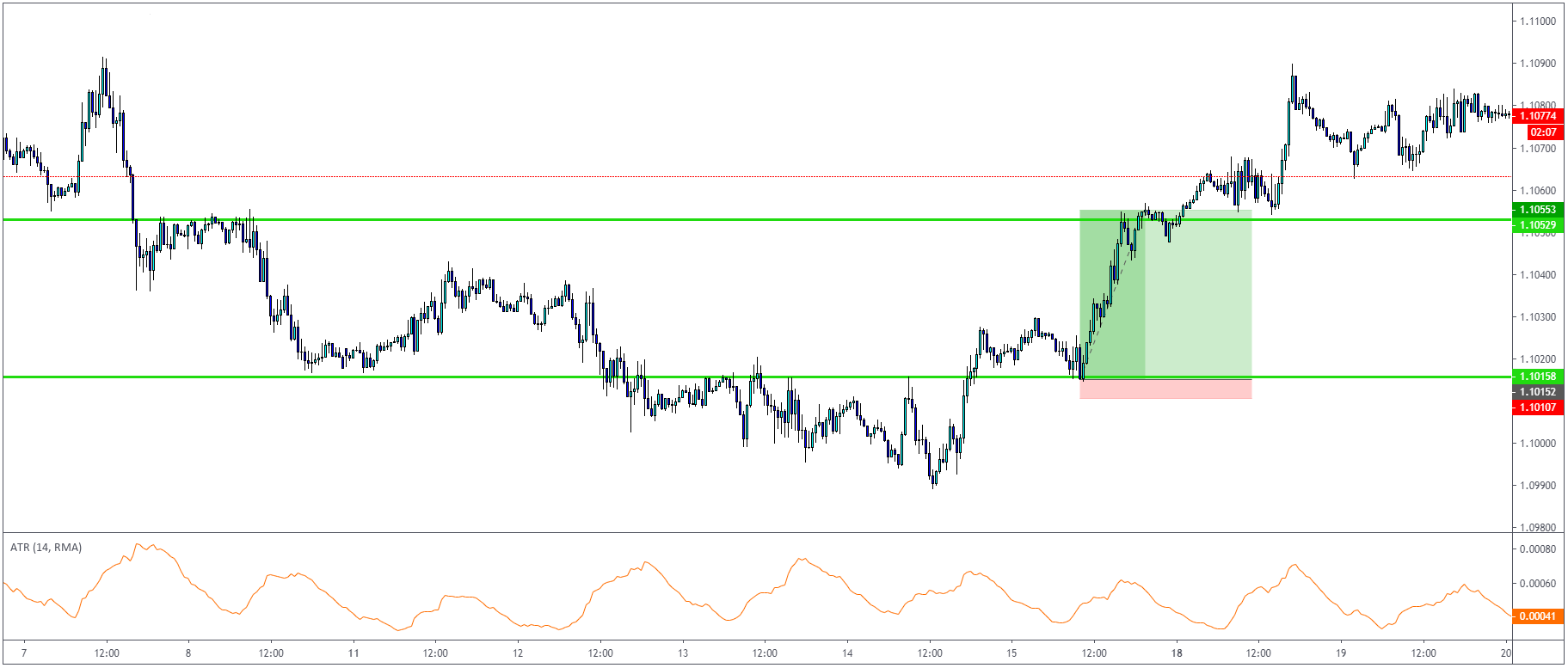
There are also several indicators on TradingView, like this one which calculates previous values of ATR to be used as dynamic S/R and also entry/exit signals on the ATR level break.
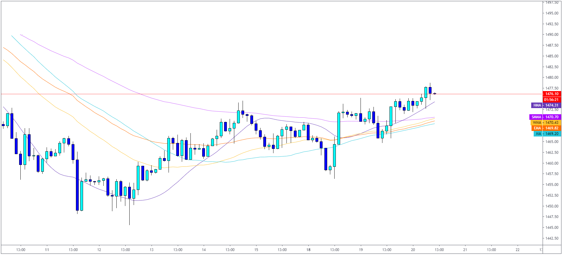
Moving Average Crossover
Moving averages are technical indicators which probably every trader knows. First, let’s cover what a moving average is: Moving average is a lagging indicator which is helping traders to “smooth” out the price and reduce noise in trading. It is one of the most popular trend-following indicators, which is commonly available.
The following are different MA types:
- Simple Moving Average
- Exponential Moving Average
- Weighted Moving Average
- Hull Moving Average
- Smoothed Moving Average
All of these are calculated a little bit differently, but we are not covering it in this article. Let’s have a look at how they are presented on the live chart.
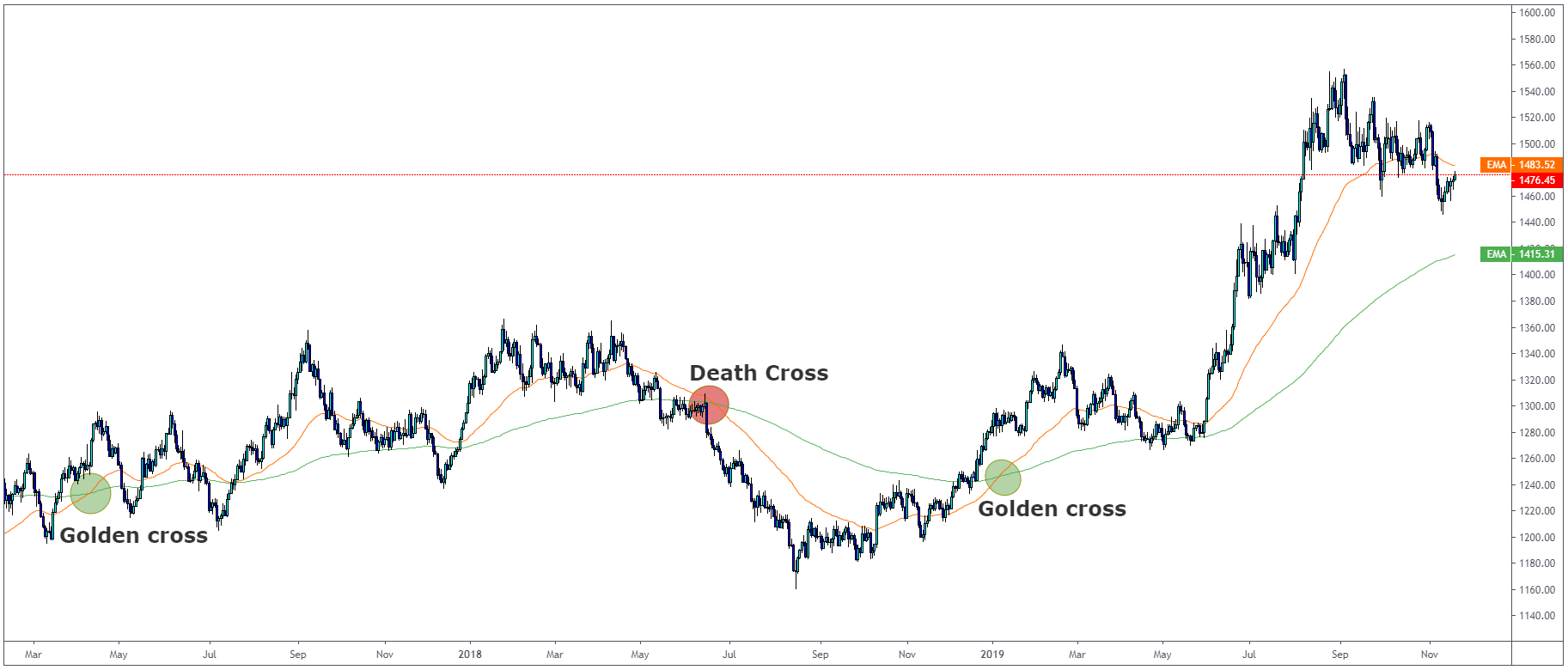
How to trade a moving average crossover?
To be quite honest, trading a moving average crossover is easy as it gets. One of the most popular crosses is 50 and 200 moving average crossover, called the golden cross or the death cross.
- A golden cross happens when 50 moving average crosses 200 moving average upwards and continues above the 200 moving average.
- Death cross happens when 50 moving average crosses 200 moving average downwards and continues below the 200 moving average.
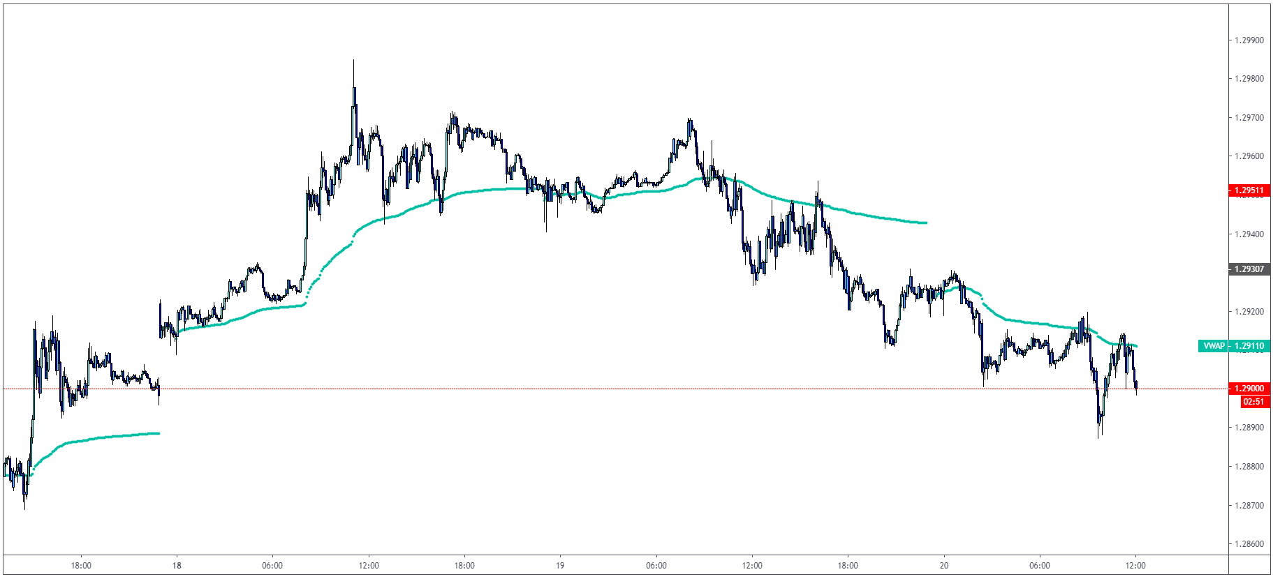
Volume Weighted Average Price (VWAP)
VWAP is heavily used amongst traders who trade according to Auction Market Theory and use Volume profiles in the day trading. If you have no idea what we are talking about, make sure to read our article about Market Profile trading here.
How to use VWAP?
The VWAP gives traders average price throughout the day based on price and volume. We plot VWAP on a chart and use it on intraday timeframes such as 5 minutes with VWAP is giving us dynamic S/R levels. The popular rule between a lot of traders who trade intraday is that they only long when the price is above VWAP and short when below.
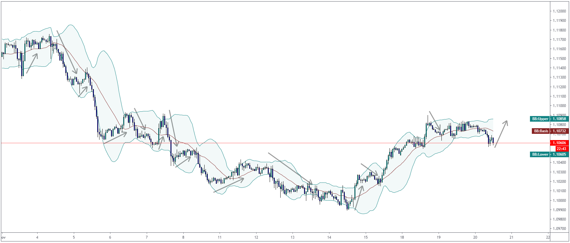
Bollinger Bands Indicator
John Bollinger, the father of Bollinger Bands, developed this technical indicator in the 1980s. Bollinger Bands are calculated by a moving average with the standard deviation above and below the median line.
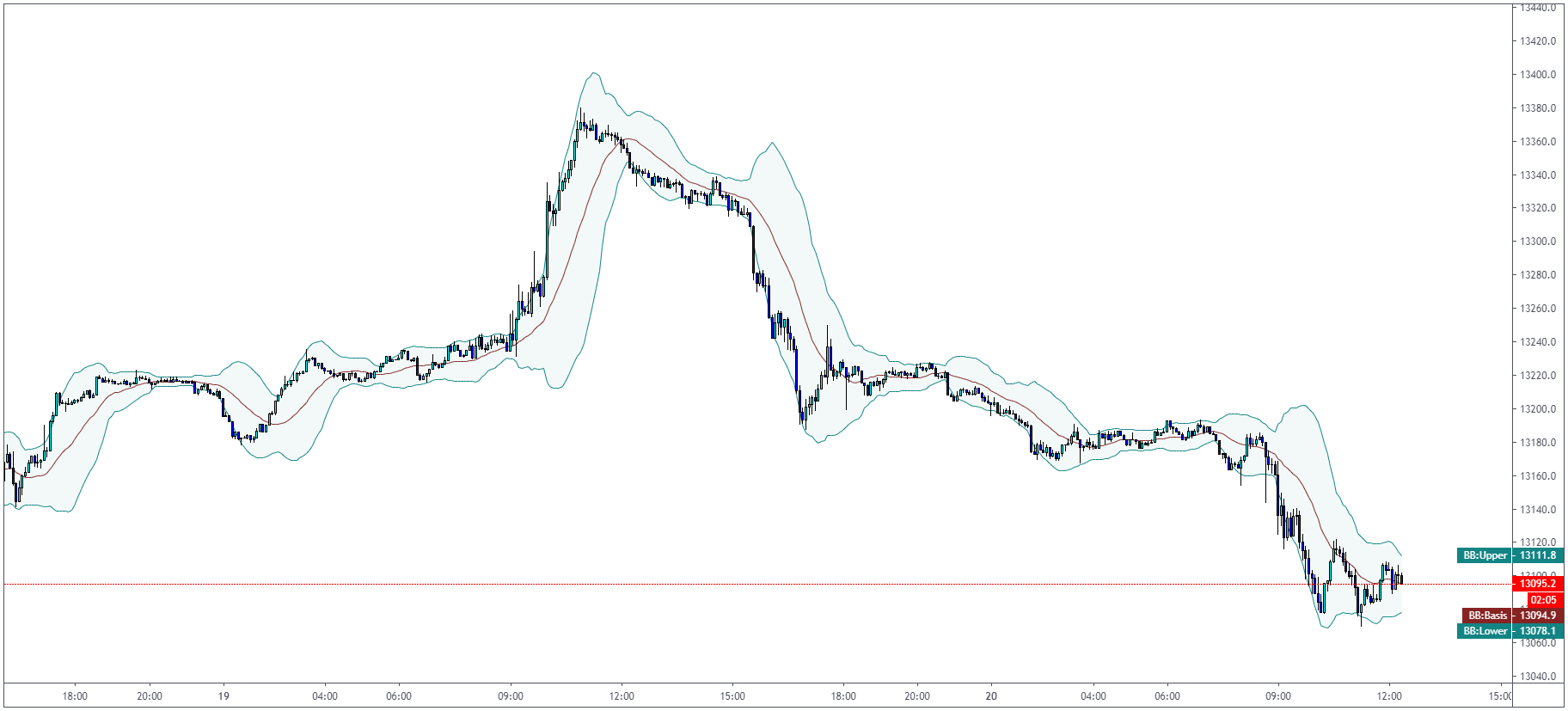
Bollinger Bands use the same principle as RSI and other oscillators with the overbought/oversold arguments. When the price reaches the upper Bollinger Band, we can assume that the market is overbought. We can assume that the market is oversold when we reach the lower Bollinger Band. The median line can be used as “balance” and also the target for your trades.