


Types of Trading Charts
Watching the market fluctuations and volatility in real-time is an essential skill to acquire. There are several ways to display data on the chart, from a simple candlestick chart to Renko or Heikin Ashi. What are the specifics of these charts and how do they differ? You will find out in this lesson.
Types of trading charts – candlestick chart, Renko, Heikin Ashi
The ways of displaying data on our price chart are pretty much endless. This is why we will never find two traders that do and watch exactly the same things in their trading. Although most traders are using candlestick charts which we covered in the previous video, there is more depth in those as well. Besides candlestick charts, we will also have a look at different graphical representations of price charts such as bar charts, Renko or Heikin Ashi charts.
Candlestick charts
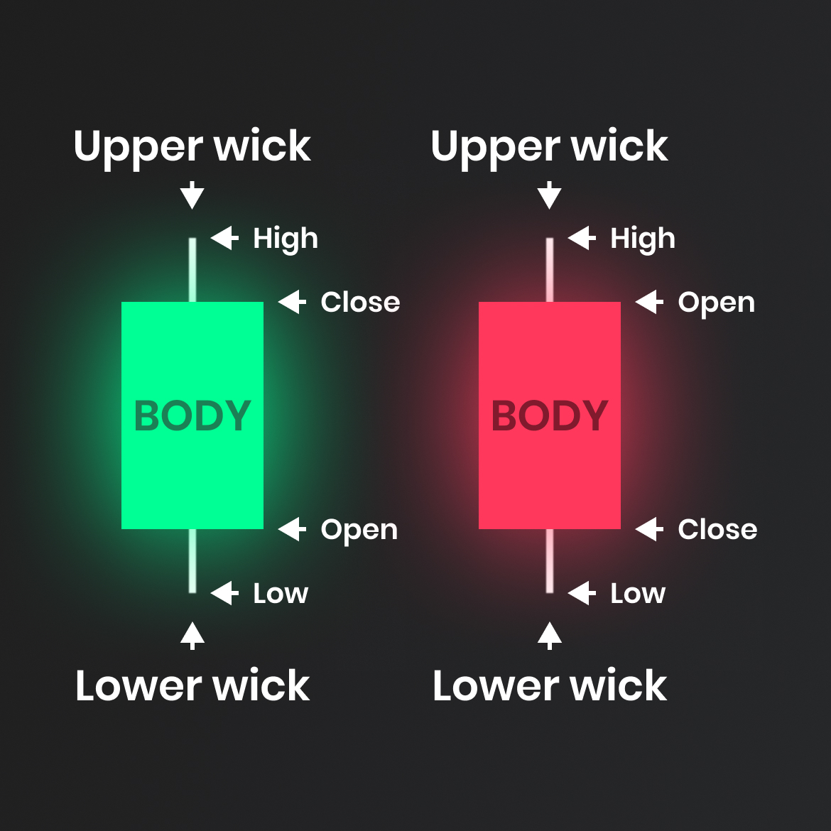
We have covered Japanese candlesticks in the previous lesson, so we will do just a quick recap now. They are the most popular methods of charting and viewing technical analysis. The anatomy of a candlestick consists of the body and the wick. If the candle closes above the open, we have a bullish candlestick. If the candle closes below the open, we look at a bearish candlestick. Wicks represent the highest and lowest points where the market traded.
As we can see in the image below, we have two candlestick charts next to each other in our FTMO cTrader platform.
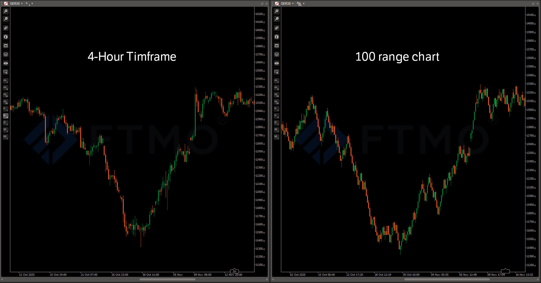
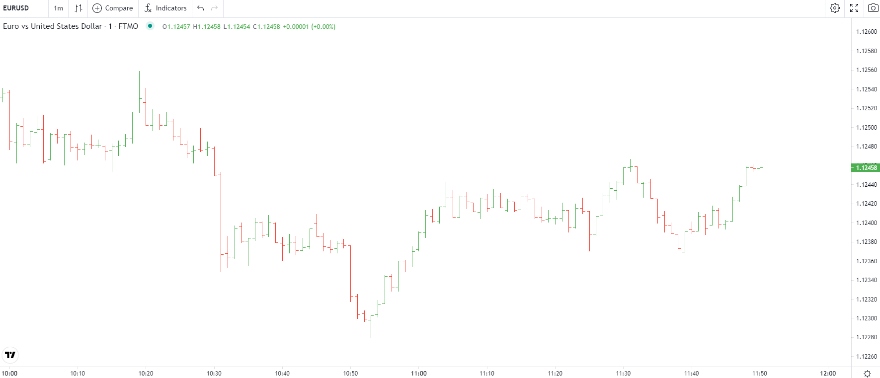
Although they look the same, there is one significant difference between them. The chart on the left is based on time and the chart on the right is not. The chart periodicity is the main function we can control when setting up our candlestick chart. The time periodicity is the most popular and common amongst traders. Most trading platforms will allow us to set up charts based on minutes, hours, days, weeks, and seconds. The most popular charts used by traders are 1-minute, 5-minute, 15M, 30M, 60M, 4-hour, daily, weekly and monthly charts. Although we can set up our chart with any setting we want, using those popular timeframes works simply because many traders are also watching them. If we use something like a 40-minute or 3-hour chart, the candlestick patterns on our chart might have a lower weight as no other traders see them. The non-time-based charts are less common, but they still can give traders valuable information. Our traders can use tick and range charts in our FTMO cTrader platform, these two are also the most popular non-time-based charts. In the tick chart, one tick represents one transaction. In other words, one tick is made when the market fluctuates by the minimal price increment.
If we take a look at EURUSD, which is quoted in five decimal places. One tick would equal 0.00001 or 1 pipette. In the range bar, every bar will end once the range between its high and low equals the chosen range. This means that every bar will have the same bar range and close either at high or low. Using a range of tick charts can eliminate noise and display trends in a much clearer picture as we will get rid of time periods when markets are not moving and staying range-bound. This can be clearly seen when we compare this DAX four-hour chart with the 100 range chart in cTrader. We can notice that both uptrend and downtrend were much cleaner on the range chart once we eliminated the time factor and put our focus on price rotations.
Bar charts
The only difference between the candlestick and the bar chart is the visual representation.
Bar charts, often called OHLC charts, are represented as vertical bars with two notches that represent the open and close of the bar. Compared to Japanese candlesticks, bar charts might be a little less clean for new traders when it comes to candlestick patterns. On the other hand, they might present a little cleaner picture when it comes to marking out support and resistance.
Renko
Renko is similar to the range and tick charts. It eliminates the time factor from trading and changes the visuals of our chart completely. We won’t see candlesticks anymore, but we will be looking at bricks instead. The name Renko came from the Japanese renga, which stands for brick.
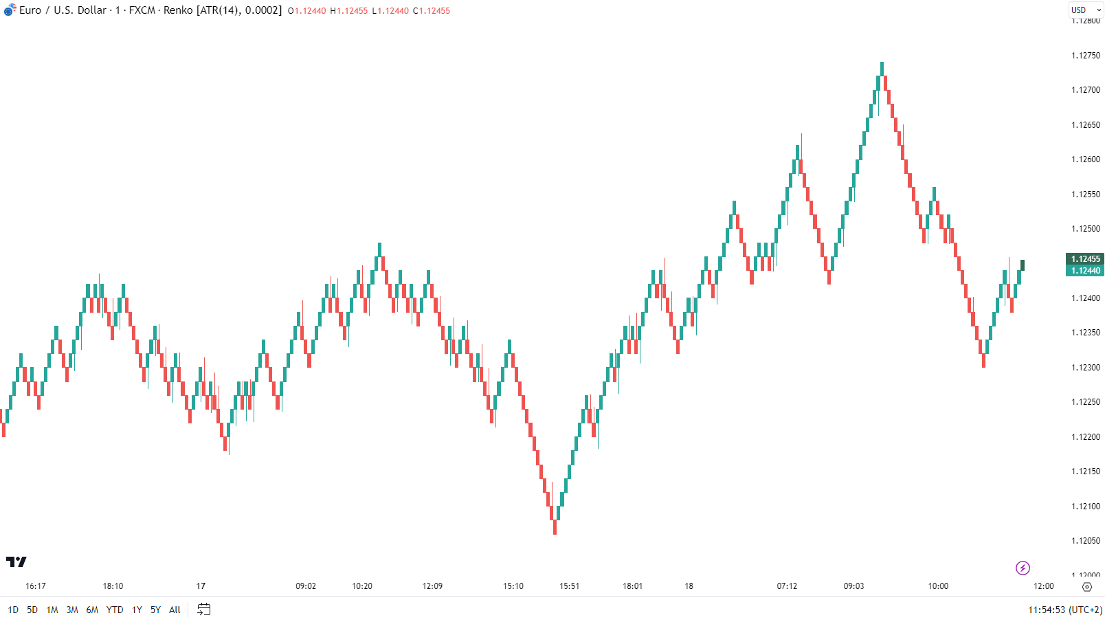
The Renko chart prints a new brick when the market moves more than the brick size away from the previous brick. Let’s say we define that one brick signifies a movement of 5 pips. So, until the market moves these 5 pips in one direction (from the close of the last brick), no more bricks will be drawn. Renko charts are not only great for filtering out noise but also for marking out support and resistance areas.
Heikin Ashi
Heikin Ashi is another chart representation that comes from Japan. It means “average bar” and although this is not something we need to know, here we can have a look at how the Heikin Ashi candle is calculated. The Heikin Ashi is constructed the same way as the candlestick chart but has a different calculation method. We can set up a Heikin Ashi chart as we want, on the specified time, range or tick.
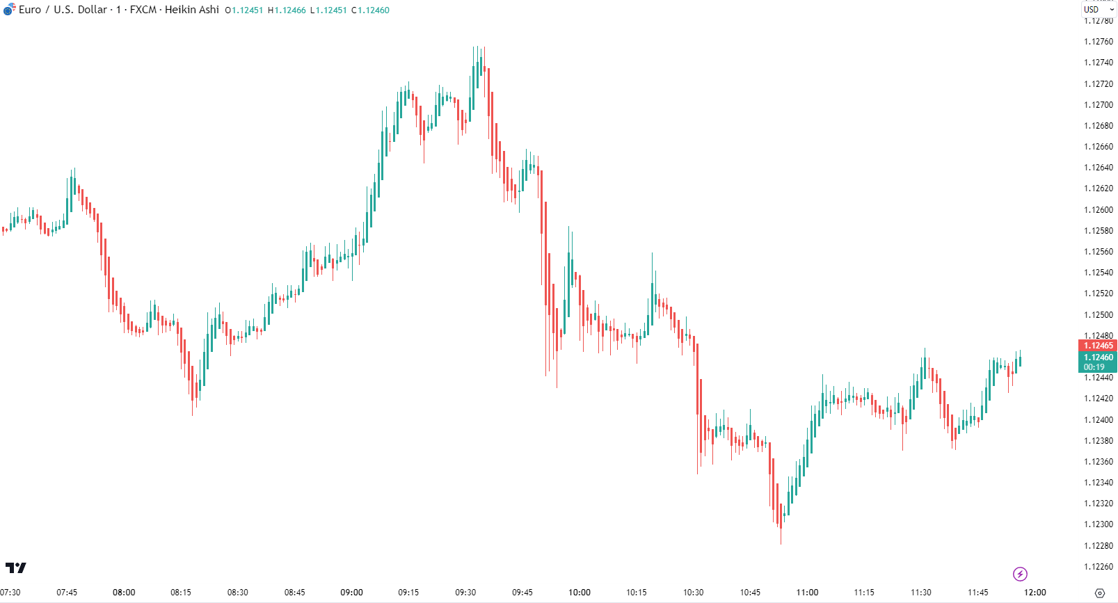
Heikin Ashi filters out the movements and makes a much easier approach to trend following. The downside of it is that we might miss some valuable information as it might smooth out the chart a little too much. But it is a great tool for both entries and trade management.
Conclusion
To conclude this chapter, the best thing we can do is to play with different charts and settings and find what suits us the best, that is always the smartest approach. Regular time-based candlestick charts will always be the most popular as they are used by traders worldwide. But tick charts, range charts, Renko or Heikin Ashi, can be utilized in our strategy and bring a lot of use to our personal trading.
